Showing posts with label tutorial. Show all posts

Wednesday, December 2, 2009

Who Needs a Fix?

Making a poster for M's Hot Chocolate fundraiser next week and I had to create a few things myself. I really like how they turned out, so I've added a few more coordinating things and zipped it all up for you. Morning Coffee is a mini-kit with only a few items in it and no alpha, but it's cute and fun. I also put in some things from my Friends Like Them kit, so if for whatever reason you did not download it, you now have a little preview. For the most part I used the Caffienated kit from Scrapgirls (♥) which I love.
Last night I learned a new trick. Actually I technically learned two. I'm so excited about how easy this technique is and how awesome it looks! I used it a lot in the creation of today's freebie, and in my poster. So today I have a tutorial for you.

You will need:
Photoshop (I'm now using CS2)
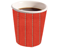
2D image of a coffee cup like this one:
I just google 'coffee cup' and then covered it with MJO_ChildhoodMemories_12x12_DotLines to give it a christmasey look.

Tools Used:
Burn Tool
Dodge Tool


All Aboard? Alright, let's begin.

  1. Open your image. If you downloaded mine, find where you put it and get it up there in Photoshop.
  2. Easiest way to remember which tool to use when, is to think about a piece of paper that has been burnt. The edges are darker than the rest of the page, because that's where it was burnt. Dodge does the opposite. We'll start with Burn. It can be found in the second section of your toolbar. Mine was originally set to the Dodge tool, but yours may already show Burn or show Sponge which is also under that menu.


  3. This part is very much like regular brushwork (the kind you would 'paint' with rather than 'stamp' on). Simply run the tool up and down the edges of your cup until you are happy with the look. Obviously it wont look 'quite right' until you've added the lighter part in the middle. I like to make a 'J' like hook near the bottom to add some extra realism. BTW, the dots are my way of showing you how to do it. It wont actually look like that :).


  4. Once your done with the edges, select the Dodge tool (same menu as burn) and go up the centre, until your cup looks sufficiently rounded.
  5. That's it. So easy, so you do it completely to your personal tastes.


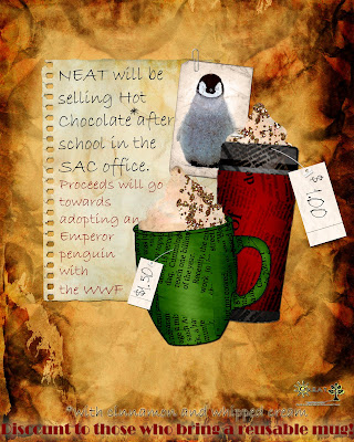
Click the poster for the Morning Coffee download link.


Remember to leave a little love for a chance to win.

Happy Scrapping ♥

Thursday, May 14, 2009

Fun with Fonts

I've realised I have a problem. It started out innocently enough. A couple minutes here and there browsing and clicking. Then minutes became hours, and files became folders. I love fonts. I love how they're named, how they instantly jazz up any layout, powerpoint or assignment when used strategically and appropriatly and I love how a slight font tweak can take a page from 0-60 instantly.

Many of you have (or really should have) several 'decorative' fonts already on your computer wheather they came with it or because you've done some poking about already, but listen, there is so much more! First thing you've gotta do, before you can even conceive the end product is get your hands on some the raw materials.

The first website I want to mention, Font Diner I stumbled across when doing an assignment for an eleventh grade project. I had decided to use a retro theme for the title page and headings and such.


Most of their fonts are for sale, however there are some really awesome ones available in their freebies section's free silverware'. is one of my favorites!

Awesome site number two is Free Digital Scrapbooking.com. It offers lots of usefull (and free) supplies and a pretty varied Fonts section. I've been going there for ever and only recently realised they had fonts!and are the two I'm most excited to use right now. They have them organized by category (Grunge, Cursive, Patriotic etc.) and I encourage you to click through and look at them all.

Most of my fonts come from whatever google turns up for me. Ussually 1001 Free Fonts, Font Freak and DaFont. These are (for the most part) pretty interchangable. They have different ways to search and view (alphabetical, grouping, author etc.) and a preview. 1001 offers a custom preview if you're having trouble picturing the end result. If your into Dingbats there's plenty of those to, though I don't get it. I'll just google the picture, I don't want to go through the alphabet to find one. LOL.

To install new font's (in Windows) open the "fonts" section of your control panel. Start>Control Panel>Appearance and Themes>Fonts (in the sidebar under See Also) OR My Computer>Control Panel>Fonts. You now have a choice. You can copy and paste the new files into this section (good if they're spread out) or you can install them by going to file>install new font then browse through the folders to find the one you saved your fonts under. After opening each folder the fonts in it will show up in List of Fonts section. You can Select All or just the ones you want. Then it's just OK and you're done.


Now on to the fun part!
When making Powerpoint presentations and title pages one thing that drives me ab-so-lutly nuts is to many fonts. However, with scrapbooking, if done right, multiple font's can look really cool. For example:


and


The first LO uses 19 different fonts, including the letters at the bottom. The second technically only uses 2, as the "m" and "y" are alphas, but it shows the effect you can achieve with vaired types.

So when should you use fonts as opposed to alphas? Personally, I use fonts anytime I'm writting anything longer than 4 or 5 letters. It's so much easier than searching for, opening in Photoshop, resizing and positioning each individual letter. If I want to be able to put the letters at different angles, resize them or add lots of effects I'll use an Alpha set.

Any questions? Feel free to comment!
And as always,
Happy Scrapping ♥

Wednesday, January 7, 2009

Happy New Year

Happy New Year everyone!

I hope you all had a great holiday and that you're still going strong with those resolutions LOL. As It is currently snowing crazily outside and I still have a half-hour until my first class of the day, I thought I'd make a post (though honestly I don't know what it'll be about). Maybe a tutorial? Now I just need a theme...hmmm...selective recolouring? Nope already did that. Oh! How about....

Grunge Look!

Now there are all kinds of products, actions and tips out there for how to do this, but I'm going to show you the easiest way, using nothing beyond what you already have.

What You'll Need
Photoshop
Photo (or other item you want to "grunge")

Tools Used
Brushes

OK, Hold on tight...

  1. Open your photo. I'm going to be using this picture I found on the internet of a band I like.
  2. Next you want to desaturate the image image>adjustments>desaturate or ctrl+shift+U.
  3. Open your brushes and select the brush called Dry Brush on Towel. You may need to load a different brush set to find it. This can be done by opening you Brushes Menu and clicking on the small triangle button on the top left. This should open a new menu - select Wet Media Brushes.
  4. I'm using plain white (ffffff), but you can use any neutral really depending on the look your going for. Using the colour you've selected "stamp" your brush along the edges and especially in the corners of your photo. The trick to to keep it from looking to uniform.
  5. If you wanted to, you could also add some tiny tears using the Polygonal Lasso. Just make a vaguely triangular shape starting from the edge of your photo and delete the area you have selected.


Tuesday, October 28, 2008

Tuesday Tutorial - Refrigerator Chic

It's been a long time. Too long really, but now, I proudly announce the return of
*drum roll*
The Tuesday Tutorial!

Some of my favorite layouts are made to look like something other than a scrapbook page. It could be a page out of a notebook, or a photo on the fridge. In order to do this I have often had to create some of the elements myself. Not because it doesn't exist out there, but usually because I was to impatient to search for it, or to cheap to purchase it. One of the easiest and most versatile is the magnet.

What You'll Need:
Photoshop
Small item that could be made into a magnet (optional)

Tools Used:
Drop Shadow
Bevel/Emboss
Text

Please keep your hands and arms inside the vehicle at all times...
  1. Open a new image in Photoshop. Any size you want. I'm going to be using a 12"x12"(864 pixels x 864 pixels) image because that is the size I use for my layouts.

  2. Take the text tool and type the letters A, B and C with each letter on it's own layer. Blocky, basic fonts work best if you're going for the classic Alphabet Magnet look. I'm using Turkey Sandwich which can be found here. I will post a list of suggested fonts as well.
  3. Now colour your letters. I'm using the primary colours, because once again it lends a very basic Alphabet Magnet feel to it. (DB0808, 192BD7, EFFC27). Highlight the text you want to colour and double click on the coloured box in your text toolbar (across the top) to bring up your colour picker.


  4. Next you want to add a drop shadow add layer style (select the stylized f from the bottom of your layers pallette)>drop shadow and the bevel and emboss effect add layer style>bevel and emboss. Tick the box for contour under Bevel and Emboss on the left of the add layer style window.


  5. Repeat step 4 with the other two layers and there you have it. Alphabet Magnets.
  6. If you want to make magnets out of an object, simply open the image, and do step 4 on it. Feel free to play around with the drop shadow and Bevel and Emboss effect untill your magnet is to your liking.


by rotating the 'magnets' slightly, you can get a slightly haphazard

Monday, March 17, 2008

Hey! A tutorial!

Look! Its a new tutorial! Woohoo!

[Monday] Tutorial: The "Poloroid Effect"

So today boys and girls we're gonna learn how to make your photo's look like old school photo's. Sound like fun? Well I thought so.

What You'll Need:
Photoshop
Picture(s)

Tools Used:
Square Marquee Tool
Fill Tool (paintbucket)

Allrighty then, pens and paper ready?

  1. Open a new image. Mines going to be 12x12 because thats what I use for scrapbooking. I'm also going to use a paper to so I can see what Im working on better.
  2. Open the photo you want to work with and drag it onto your new document. I'm going to use the is picture from Coronado Springs resort in Disney World.
  3. I usually turn my photo so it's on a bit of an angle because it gives it a natural careless look that I think looks really good. You can do this by hovering over one of the photo's corners until you see a curved arrow with two heads. Once you see that you can click and drag your photo in the direction you want to turn it.
  4. Next go to your layers pallet and ctrl+click on your photo. This will produce a marquee around the photo, saving you a lot of trouble.
  5. Without deselecting, create a new layer (ctrl+n or file>new layer). This new layer should be the exact size and position of your photo.
  6. Now make click on the new layer in your layer pallet, but make sure you keep the original selected. Next get you fill tool (the paint bucket in your tools panel) and fill your selection with white (colour code ffffff).
  7. On the layers pallet drag the new layer down so it is listed below the original, this should put it underneath that layer.
  8. Now you need to drag the edges of your new white layer out to give your photo a border. Don't make it too wide, just a small one will do. It's not going to be perfect and will probably take some adjusting until you get a look that works for you.
  9. Now add a drop shadow and your photo is complete!
For a poloroid photo:
  1. you'll need to add a wider border at the bottom. Often this looks odd with longer or wide photo's, so if you want this look you may need to do some trimming like I did here. Ultimately you want your photo to be a little more square.
  2. Next add a smaller rectangle to the white space you now have at the base of your photo. Use a different colour while positioning it so you can see it better, you can change this later. Place the rectangle in the centre of the white space.
  3. Add a soft bevel layer>layer style>bevel emboss (Style: inner bevel; Technique: Smooth; Depth: 31; Direction: Up; Size:5)
  4. Fill this smaller rectangle in with white and add a drop shadow


  1. Happy Scrapping ♥

Tuesday, January 8, 2008

Tuesday Tutorial: Selecting

Hey everybody! How was your holidays? I hope you and your family enjoyed them as much as I did (hence the lack of tutorials). As a welcome back we're going to go over how to select things in Photoshop and I also have some new products available in the shoppe.

What you'll need:
Photoshop
A photo or image or some sort

Tools Used:
Lasso
Polygonal Lasso
Magentic Lasso
Magic Wand
Marquee's

OK, here we go,

Lasso Tool

There are three types of lasso's in Photoshop 7. The original lasso, the polygonal lasso and the magnetic lasso.

The original lasso works much like an exacto knife might. You drag it along the edge of an object until you've selected the area you want.


This can be tricky to do though, which is why I prefer the Polygonal lasso. With the polygonal lasso, you click somewhere to make a starting point and when you release, there is a line extending from where you clicked to where your cursor is moved. Click again to make a corner and go a different direction. You can even do rounded edges this way, by making lots of "starting points".

Finaly the Magnetic lasso tool will "stick" to all the pixels of a certain colour. First click to make your starting point then move your mouse around the edge of your object. When you come to a sharp corner, or if your line begins to bow in on you, simply click along the edge to make
another point.

With all three Lasso's, double click when you get back to the beginning. If you double click before this photoshop will automatically connect the start and end points with a straight line.
Magic Wand
The magic wand is one of the easiest to use and perhaps the most annoying. It will select all the pixels of a single colour (and colours very close to it) with a single click. However this does not work well with photographs or anything else with blending and subtleties to it as you are likely to end up with lots of area selected that you didn't want. To use it, you simply click on a spot that is the colour you want to select, all the pixels that Photoshop recognizes as the same or very similar in colour will be selected until another colour gets in the way.

Marquee's
Marquee's are very straightforward. You just pick the shape you want, then drag it out until the area you wish to select is contained within it. This works well when you wish to simply chop things off or select big chunks.


Tuesday, December 18, 2007

Tuesday Tutorial - Selective Desaturating

This Tuesday, we're going to go over how to make part of you photo's black and white, but keep the rest coloured or vice versa. This technique is great when you want to bring attention to a certain part of the picture only, such as the colour of something or someones eyes.

Tools Used:
Polygonal/Magnetic Lasso
Desaturation


What You'll Need:
Photoshop
Your picture


Ladies and gentlemen, start your engines...

  1. Open you photo. I'm going to use this photo of red tulips outside of my high school.
  2. Next select the area you want to remain coloured (or if there is more coloured than black and white, select the area you wish to desturate). The easiest way to do this is using the magnetic lasso tool. This will automatically "stick" to the edges of a shape based on the pixel colour. However sometimes it gets confused and can be frustrating so you may want to use the polygonal lasso.
  3. With both tools, you simply click at your starting point then guide the line around the shape. With the Polygonal lasso you will have to click again at any corners as it only does straight lines. Double click when you get back to the starting point.
  4. Create a new layer of what you have just selected. edit>copy, edit>paste or ctrl+J If you selected the area you wanted to destaurate, rather than what you wanted to keep coloured, invert you selection first. select>inverse or ctrl+shift+i)
  5. Select the original image in your layers palette and desaturate it image>adjustments>desaturate or ctrl+shift+u
  6. Last step is to merge the two layers. layer>merge visible (or merge down) or ctrl+shift+E (ctrl+E)
Perfect!

Here are some examples:


Tuesday, December 11, 2007

Tuesday Tutorial - Easy Recolouring

So for today I'm going to show you how to quickly recolour something without having to paint over it.

What you'll need:
Photoshop
Object you wish to recolour

Tools Used:
Hue/Saturation adjustment

Lets begin
  1. Open your object in photoshop. I am going to be using a paper EHI Destinations paper blue, a past Scrap Girls freebie.
  2. Open the Hue/Saturation menu image>adjustments>hue/saturation You can also do this by hitting ctrl+u
  3. Using the Hue slider, find the colour you like. The Saturation slider will adjust how much colour your adding, making it brighter as you slide it to the right and the Lightness slider will lighten or darken your image.
That's it :)